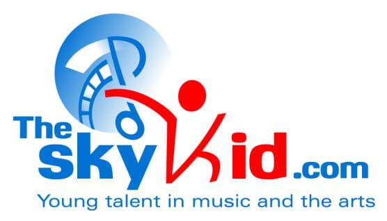
theSkyKid.com unveils its new official logo.
TheSkyKid.com – a leading online media site that promotes young artists in music and the arts unveiled its new logo today. It’s designed to reflect the site’s commitment to young talent in all aspects of the arts. The blue and red colors used in the logo are complementary and make the logo stand out, while also creating an aesthetically pleasing feeling for the viewer.
The modern and expressive logo for TheSkyKid.com conveys the name, the intended audience, and the mission of the website through the fonts, colors, layout, and most obviously, the integrated graphic elements. Through that, the arts, children, development, and excitement are conveyed.
The word “kid” is in an eye-catching red, with a stylized image of a child in a dancing, jumping or rejoicing pose. The designer used a sky blue color for the rest of the logo, but deepened the color to make it bolder. A whimsical but readable and professional font was chosen to both convey the youth aspect of the site, while remaining credible and reliable.
Behind the outstretched arm of the child, a musical quarter note tilts to the side, illustrated in a stylized but recognizable way. Movie film gently curves into the music note, and together they convey the Arts, as well as music and movies specifically.
A round, fading circle grounds the music and film elements while providing dimension and cohesiveness to the logo. The blue color and the blue circle element most obviously represents the sky. The circular shape was also chosen to represent the globe, and children’s expanding knowledge of the world, as well as the worldwide aspect of the internet.
The new logo is modern, yet stylish — instantly recognizable and very memorable — bringing instant association with the goals of the site. Parts of the logo illustrate key areas of the site’s mission – to promote young talent in film, music, dance and theatre.
